Global Events Design
2018 – 2025
Art Director
UX Designer
Motion Designer
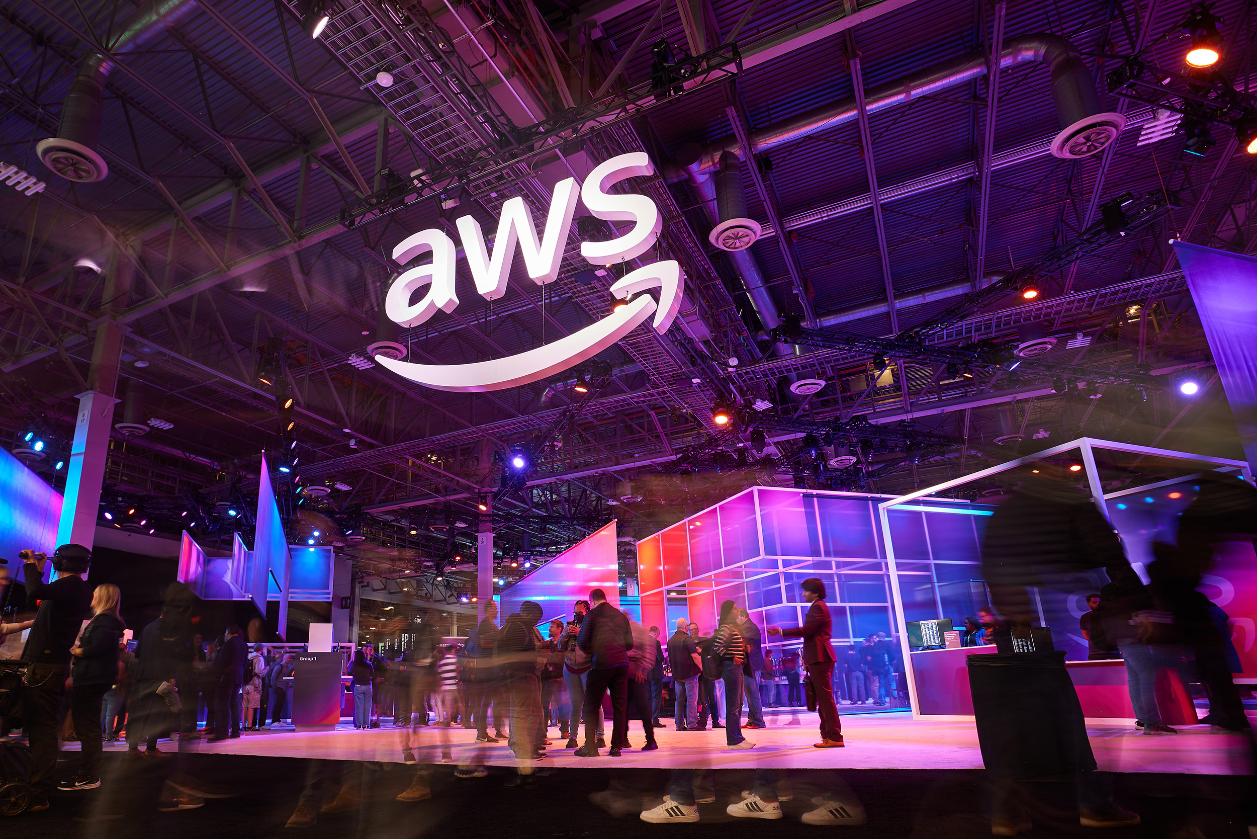
Seven years on AWS's global event program — re:Invent, re:Inforce, Summit, and the Machine Learning Summit. Started as a visual designer and was promoted to Motion Art Director, owning visual and motion direction across keynote screens, signage, broadcast, and merch. 50,000+ in-person attendees a year, 10+ venues.

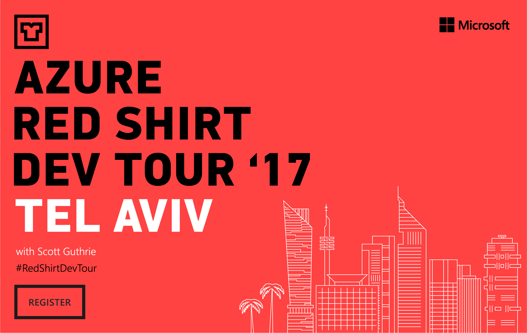
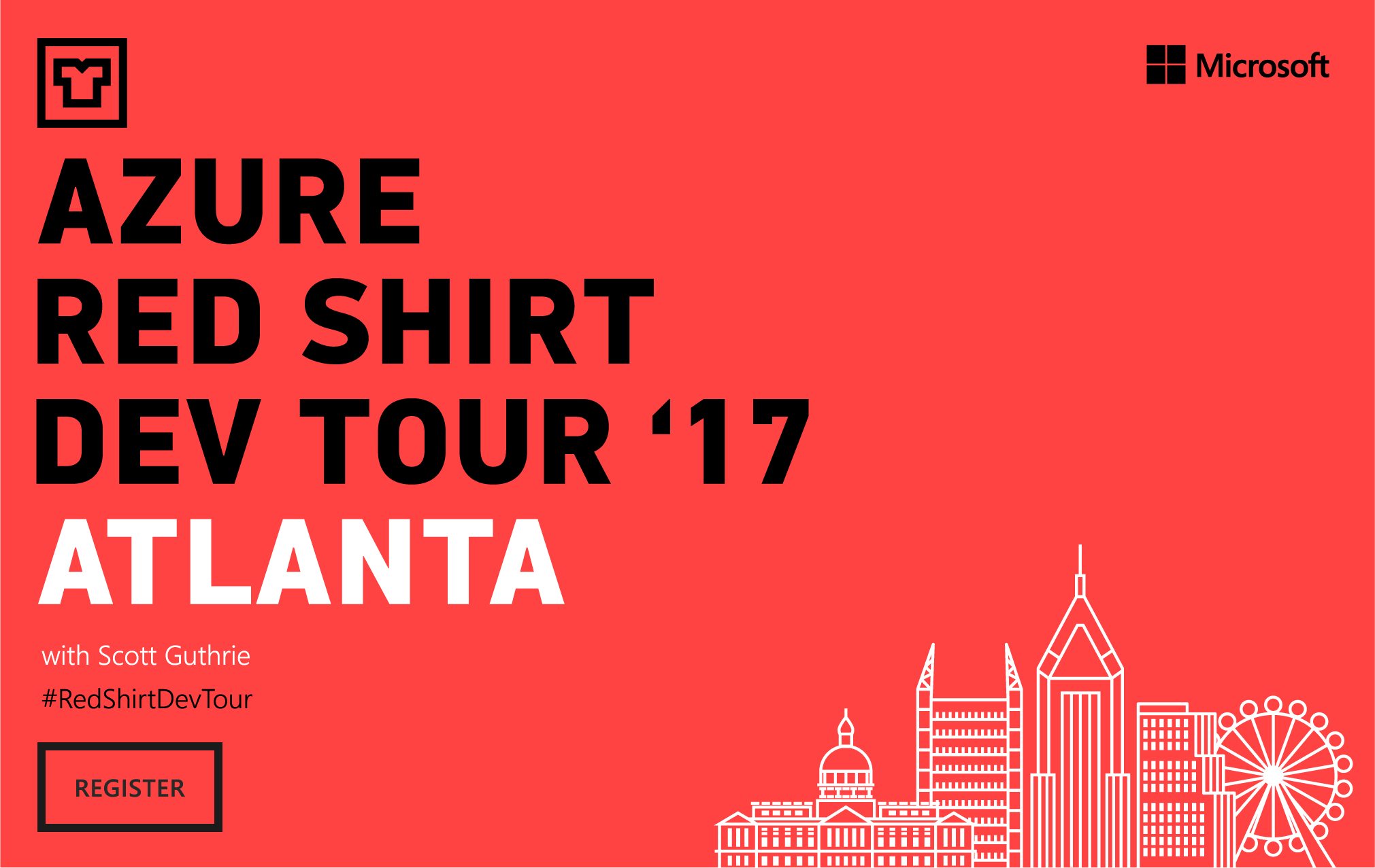
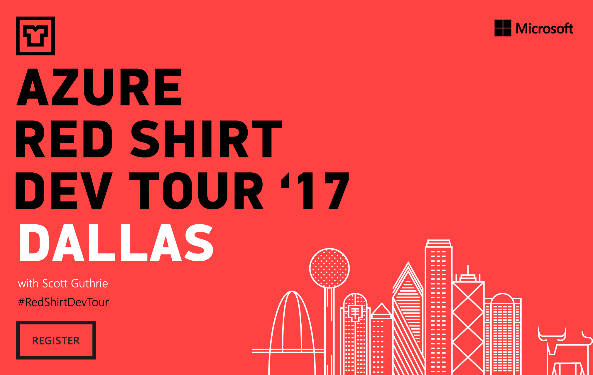
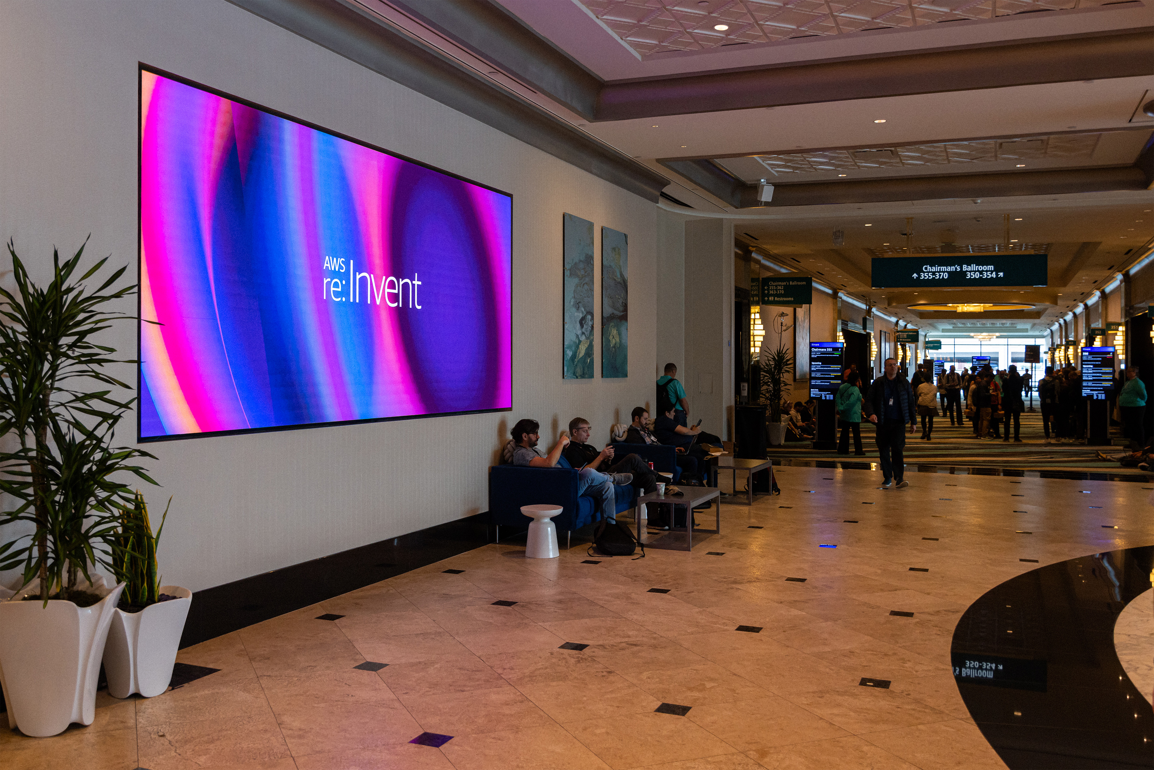
reInvent
Monday Night Live
Motion Art Director
One of five keynote broadcast packages I designed for re:Invent week. Each keynote ran a slightly different colorway on a shared motion language — same system, different temperatures across the week.
For Monday Night Live I designed the on-screen logo, art-directed the stage look-and-feel with the production vendor, and packaged the motion for handoff. Vendor took it to broadcast finish.
For Monday Night Live I designed the on-screen logo, art-directed the stage look-and-feel with the production vendor, and packaged the motion for handoff. Vendor took it to broadcast finish.

reInvent
Hotel Broadcast Channel
Dedicated motion channel piped to attendee hotel-room TVs throughout re:Invent week. For the 50,000+ attendees not in the keynote room, this is how they followed the conference — live keynotes when broadcasting, a daily-refreshed motion package between them with schedules, recaps, and venue info.
I designed the master, produced each daily refresh, and packaged it as Motion Graphics Templates (MOGRTs) so production vendors could swap content live without ever opening After Effects.
I designed the master, produced each daily refresh, and packaged it as Motion Graphics Templates (MOGRTs) so production vendors could swap content live without ever opening After Effects.
Building systems that scale
re:Invent grew from a single conference into a year-round, multi-channel design operation. Each year ran a different brand system but the underlying motion templates, broadcast infrastructure, signage standards and web design & development stayed consistent. I helped scale that core so the same operation could handle a new visual language every twelve months without rebuilding from scratch.
The harder problem was building motion templates and signage guidelines that other designers and agency partners could ship from without me on call. Each year we saw an excess of 7,000 deliverables across every channel.
The harder problem was building motion templates and signage guidelines that other designers and agency partners could ship from without me on call. Each year we saw an excess of 7,000 deliverables across every channel.


AWS re:Invent Brand
The re:Invent visual identity: gradient-led, type-forward, built to flex across signage, broadcast, and digital. Production Club led the brand. As Motion Art Director I directed its motion expression through animation language, transition logic, broadcast-ready templates — across signage, info kiosks, breakout-room IDs, and the keynote stages both large and small.

AWS re:Inforce
The cyber security conference.


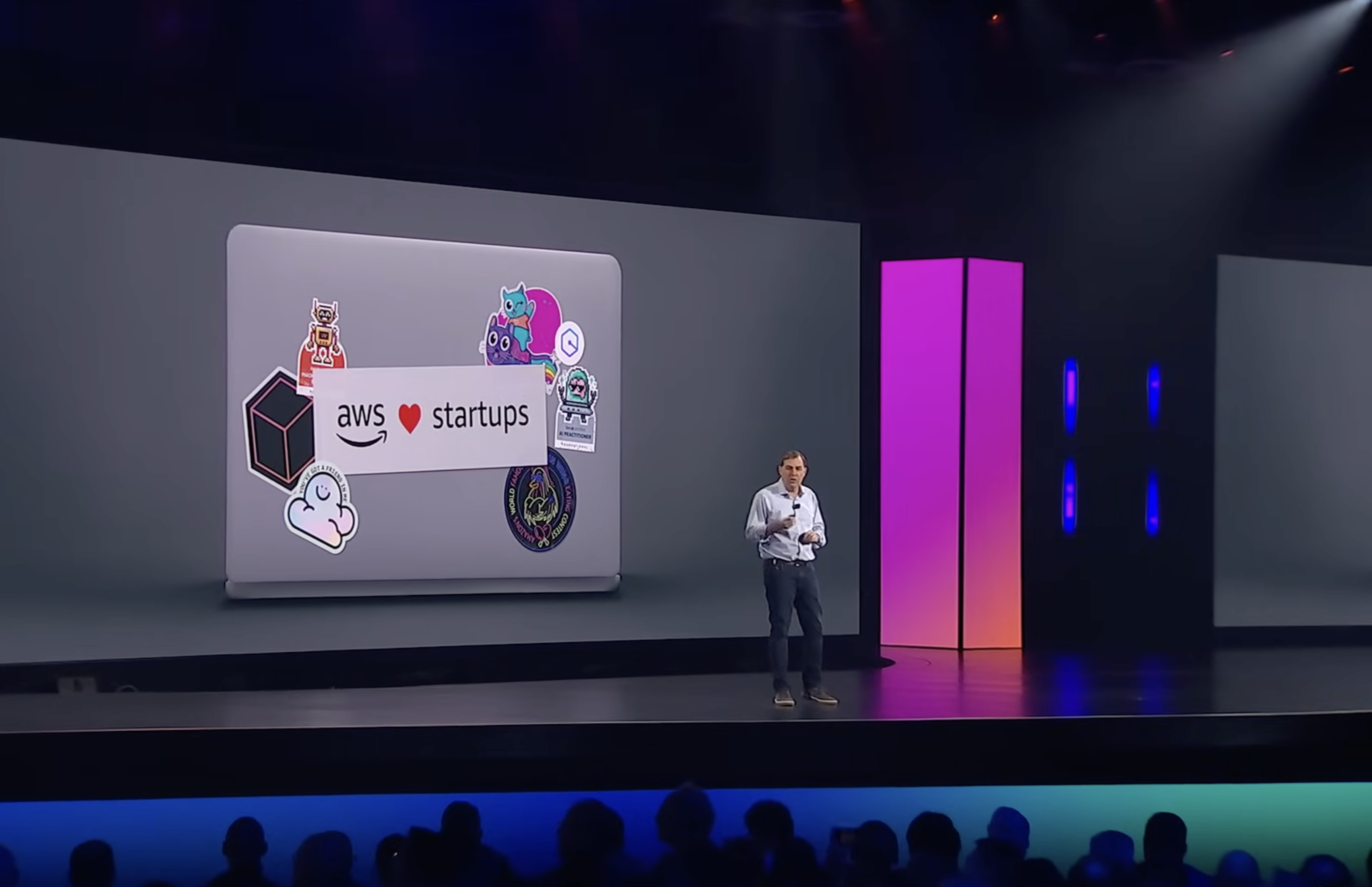
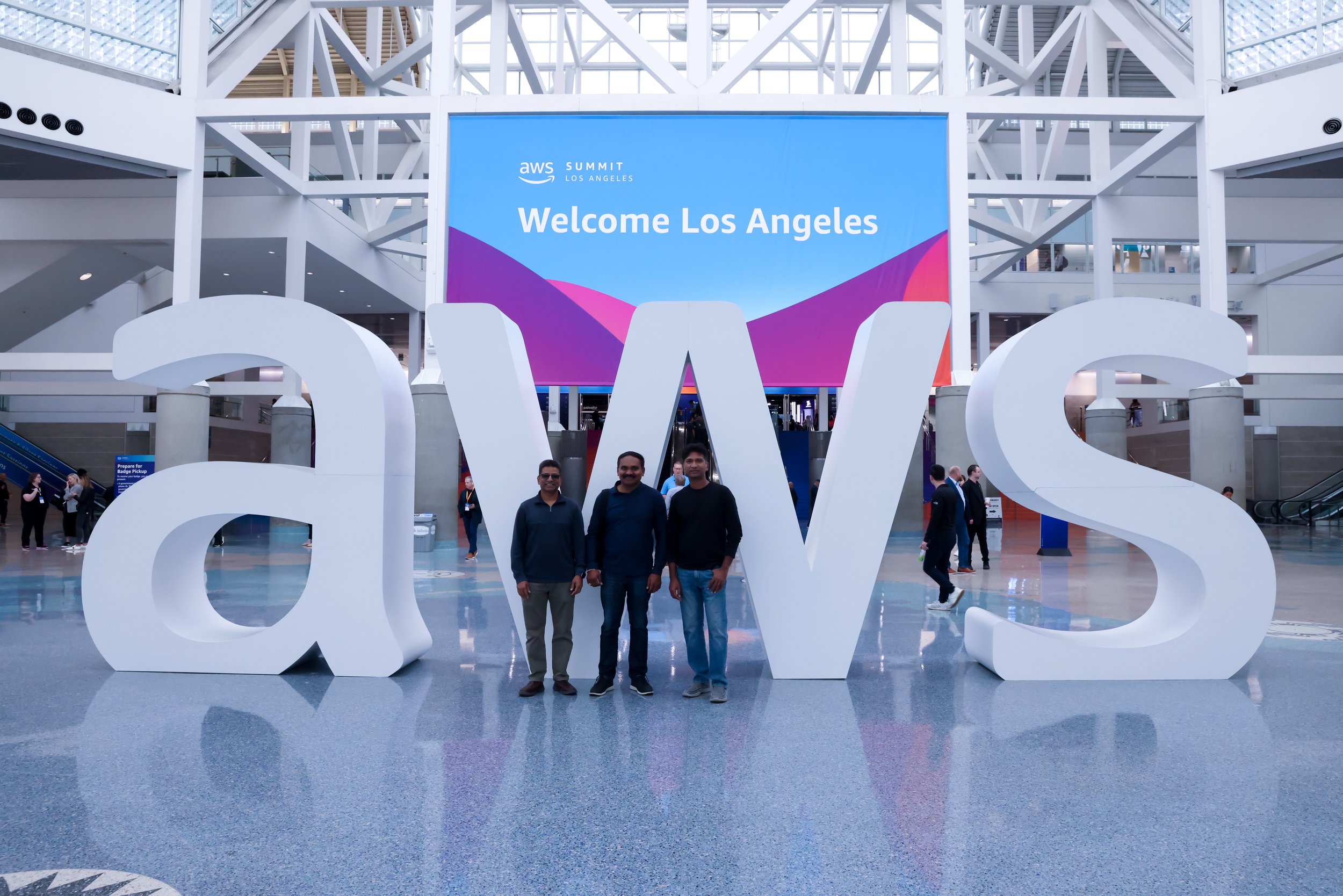
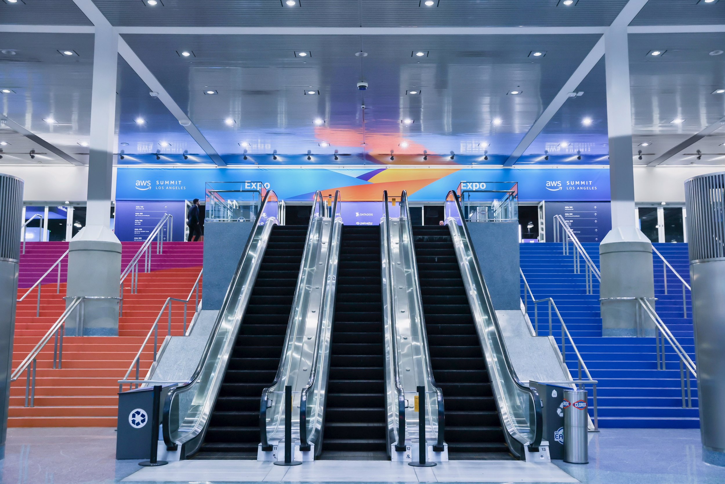
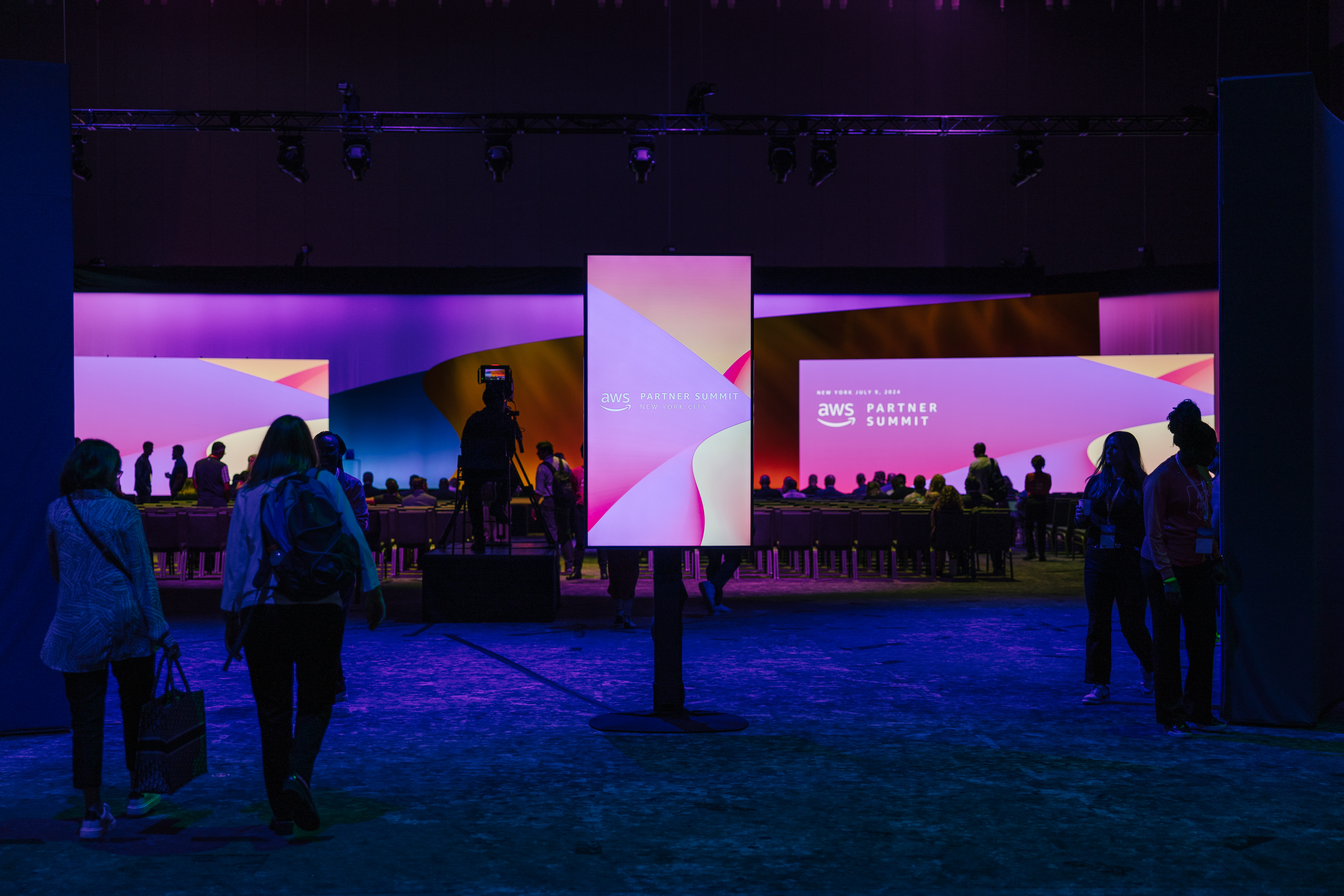
AWS Summits
re:Invent but bite-size The AWS Summits are a global developer conference with all the same big names and similar structure of branding and deliverables.


Amazon re:Mars
An amazon technology conference showcasing the latest in Machine Learning, Automation, Robotics and Space.

AWS Imagine
A small online and in-person event targeting specific niche markets like healthcare, government and education.


AWS Sales Kickoff
Internal annual event for employees and vendors to plan the year ahead.

AWS Machine Learning Summit
Developed a base animation background that was used for broadcast graphic templates, social media and web assets.